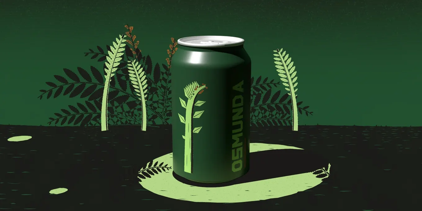
How small can the small print on a can be?
Ebbi · 10 October 2026
The back of a drink can holds a few lines that must be there — what it is, what’s in it, how to keep it — on a label that cannot grow. So the type shrinks, and the designer decides where to stop: usually with a printer’s number in points and the law’s in millimetres, and never the can maker’s.
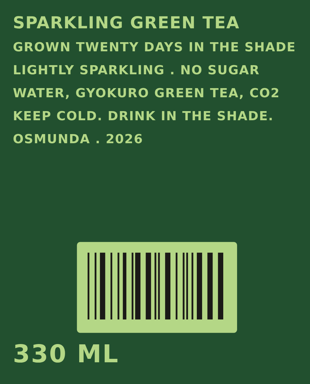
I set those lines for a green tea can of my own. By eye, they looked like any can’s small print. Measured, they passed the law and failed the can makers’ rules three times.
This is that back, line by line, and the one I set to replace it — so you can see which rule decides yours.
The law: passed
In Europe the rule for these lines is one number. The words a food or drink must carry are set in a size whose x-height — the height of a small x — is at least 1.2 mm. On a pack whose largest side is under 80 cm², it is 0.9 mm; the wall of a 330 ml can is far bigger.
Why the small x, and not the whole letter? The European Commission put the reason plainly in 2023, writing about the labels on chemicals: the legibility of a text “is primarily influenced by the size of the minuscule letters”. A rule on the whole size would let a typeface with tall capitals and tiny small letters through.
My back is set in capitals, and the law still measures the size it is set in by its small x. That x was 1.285 mm. It passed.
Here a designer meets the first trouble: nobody counts in the same unit. The law measures the small x, in millimetres. One can maker measures the capital, in millimetres. Another measures the whole type, in points — the size you type into your design program. The same line on my back was 1.285 mm, 1.713 mm and 6.66 pt, depending on who was asking.

The can makers: failed three times
Then I held the same back against the companies that print the cans. Their rules are public, if you know where to look, and for my back they ask more than the law — because my letters are light on a dark can.
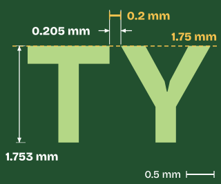
Ardagh, which prints cans across Europe, asks a light capital to stand at least 1.75 mm tall. Mine stood 1.713 mm. Failed, by 0.037 mm.
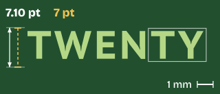
Crown’s guide for its North American presses asks light type on a dark can to be at least 7 pt. Mine was 6.66 pt. Failed.
Ardagh, and NOMOQ, a digital can printer, ask for at least 0.2 mm between any two letters. In “TWENTY” the T and the Y came within 0.108 mm of each other — the only one of the back’s 103 pairs under 0.2 mm. Failed.
And one more, the law’s own. The figures of the volume have a rule older than the x-height: on a pack from 20 cl up to a litre, at least 4 mm high. My “330” stood 3.48 mm. The small print passed the law. The can did not.
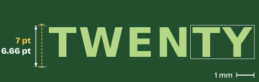
The whole type, against Crown’s floor for light type on a dark can: short of it.
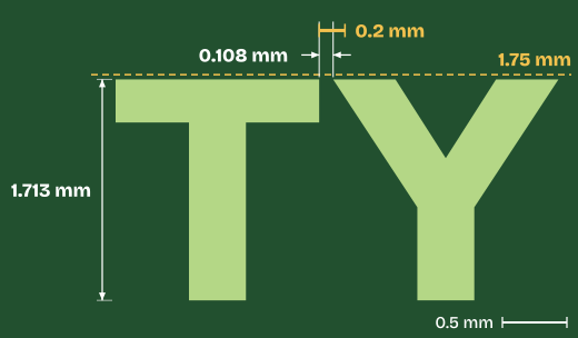
The T and the Y, larger still — the capital against Ardagh’s floor, the gap against Ardagh’s and NOMOQ’s: short of both.
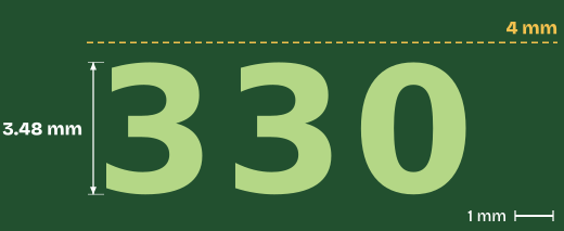
The figures of the volume, against the law’s floor for a pack of 20 cl to a litre: short of it.
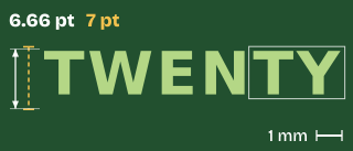
The whole type, against Crown’s floor for light type on a dark can: short of it.
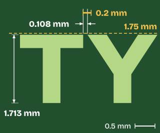
The T and the Y, larger still — the capital against Ardagh’s floor, the gap against Ardagh’s and NOMOQ’s: short of both.
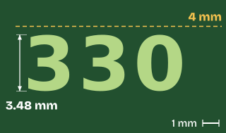
The figures of the volume, against the law’s floor for a pack of 20 cl to a litre: short of it.
Why the can makers ask for more
Why would a can maker ask more than the law? Because of what a press does to light letters on a dark ground. A can is printed fast, on curved metal, and the ink spreads a little as it lands. Crown’s guide says it in one line: “there will be press gain (ink spread).” Ardagh’s says it in two: “Positive elements tend to grow. Negative Elements tend to fill in.”
Light letters on a dark can are the gaps the dark ink leaves open. Let the ink grow and the letters thin, the space between them closes, and a T and a Y that nearly touch in the file can touch on the can. So both makers ask more of light letters than of dark ones: Ardagh a capital of 1.75 mm against 1.6, and a stroke of 0.3 mm against 0.15; Crown 7 pt against 6.
The second back
So I set the back again, to the strictest of every rule at once.
The typeface. The second back is set in PT Sans Caption, the cut of PT Sans drawn for small sizes: wider letters, a looser fit, open shapes that spreading ink is slower to close.
The pairing, off. A typeface moves some pairs of letters closer — a T tucks in toward a Y. At this size that tuck would bring the T and Y of “TWENTY” to 0.092 mm. So every pair stands at its plain width, and the space between all the letters opened a little, from 0.12 to 0.18 mm.
The 2 of CO2. Written properly it is a small, lowered 2, and that is how my own story page writes it. On the can it is full size: a small 2 would print under the 1.75 mm floor.
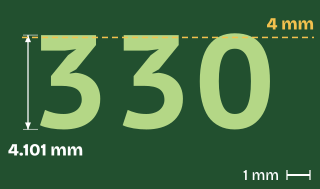
The volume. “330 ML” is set so its figures stand 4.10 mm.
Does it pass?
Measured the same way, the second back clears every rule at once. Its x is 1.315 mm, over the law’s 1.2. Its capital is 1.753 mm, over Ardagh’s 1.75 — by 0.003 mm. Its type is 7.10 pt, over Crown’s 7. The stroke of its I is 0.371 mm, over 0.3. Its closest letters stand 0.205 mm apart, over 0.2 — by 0.005 mm. Its “330” stands 4.101 mm, over 4.
Two of those margins are a few thousandths of a millimetre. The back is as small as every rule allows, and no smaller.
And what no file can show: a file that passes by thousandths is not yet a can that passes on the day — how far the ink spreads is decided on the press. This can I made to show my work; it is on no shelf and has never been printed. What I can show you is its file, measured.
The first back · set by eye
The second back · set to every rule
The whole type, against Crown’s floor

Short of it.
Clears it.
The capital, against Ardagh’s floor; the gap, against Ardagh’s and NOMOQ’s
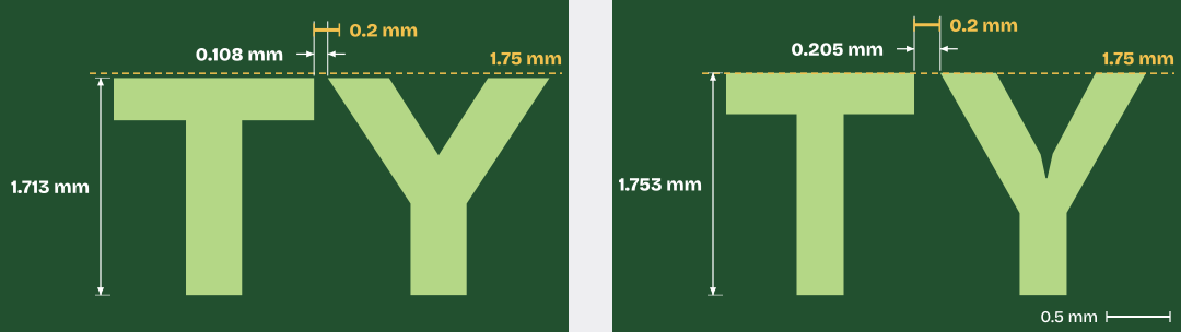
Short of both.
Clears both, by 0.003 mm and 0.005 mm.
The figures of the volume, against the law’s floor

Short of it.
Clears it.
First back
Second back
The whole type, against Crown’s floor
First back: short of it.
Second back: clears it.
The capital, against Ardagh’s floor; the gap, against Ardagh’s and NOMOQ’s
First back: short of both.
Second back: clears both, by 0.003 mm and 0.005 mm.
The figures of the volume, against the law’s floor
First back: short of it.
Second back: clears it.
And yours?
Would your back fail the way mine did? Two things decide it, and you can check both now: the colour of your letters, and your typeface.
I measured sixteen typefaces designers reach for, worked out the size each rule asks of each one, and noted which rule asks the most. Light letters on a dark can: the law’s 1.2 mm decides in none of the sixteen. Ardagh’s 1.75 mm capital decides in eleven; Crown’s 7 pt in the other five — Inter, Lato, Open Sans, Oswald and Roboto.
On a dark can, the law is never the rule that decides your small print. The press is.

Dark letters on a light can, the typeface decides: the law in four of the sixteen, Ardagh’s 1.6 mm capital in eleven, Crown’s 6 pt in one.
And if your can holds an American beer, every letter of its mandatory words, small letters too, must stand 2 mm tall — across the sixteen, 8 to 11 pt. Since 2011 the US regulator has approved beer labels without checking their type size; the 2 mm is the brewer’s alone to hold.
Why it is this small
The EU’s first proposal, in 2008, asked 3 mm; the law of 2011 settled on 1.2 mm of x. People still squint — a father who could not read the ingredients on his son’s sweets without a magnifying glass, radio listeners in Belgium who need reading glasses, even a magnifying glass, to read the food they buy.
Every rule, side by side
| Whose rule, and for what | What it measures | The floor | Where I read it |
|---|---|---|---|
| EU law, Regulation 1169/2011, Art. 13the words a food or drink must carry | What it measures: the small x | 1.2 mm (0.9 mm on a pack under 80 cm²) | Where I read it: the consolidated text of 1 Apr 2025 |
| EU law, Directive 76/211/EEC, Annex I 3.1the figures of the volume, 20 cl to 1 l | What it measures: the figures’ height | 4 mm | Where I read it: the consolidated text of 26 Jul 2019 |
| Ardagh, Europelight letters on a dark can | What it measures: capital · x · stroke · gap | 1.75 · 1.2 · 0.3 · 0.2 mm | Where I read it: its Graphics Portal, Text and Checklist |
| Ardagh, Europedark letters on a light can | What it measures: capital · x · stroke · gap | 1.6 · 1.2 · 0.15 · 0.2 mm | Where I read it: its Graphics Portal, Text and Checklist |
| Crown, North Americalight type on a dark can | What it measures: the whole type, sans serif | 7 pt (10 pt serif) = 2.47 mm | Where I read it: Crown Graphics Design Specifications, 2024 |
| Crown, North Americadark type on a light can | What it measures: the whole type, sans serif | 6 pt (9 pt serif) = 2.12 mm | Where I read it: Crown Graphics Design Specifications, 2024 |
| NOMOQ, digital can printinglight letters on a dark can | What it measures: capital · x · stroke · gap | 1.75 · 1.2 · 0.3 · 0.2 mm | Where I read it: its Artwork Preparation Guidelines |
| US law, 21 CFR 101.2the words a food or drink must carry | What it measures: the small o, or the capitals | 1/16 inch = 1.59 mm | Where I read it: the eCFR as of 6 Oct 2026 |
| US law, 21 CFR 101.7the net quantity, panel of 5 to 25 sq in | What it measures: the small o, or the capitals | 1/8 inch = 3.18 mm | Where I read it: the eCFR as of 6 Oct 2026 |
| US law, 27 CFR 7.53every mandatory word on a beer over half a pint | What it measures: every letter | 2 mm | Where I read it: the eCFR, at Cornell’s LII |
| Verpact, the Netherlandsthe letters of the deposit mark | What it measures: letter height | 1.2 mm, the mark at least 1.2 cm² | Where I read it: Annex II, Deposit logo metal beverage cans, 2022 |
| Ball— | What it measures: — | not public | Where I read it: its print guide sits behind a registration |
Every rule above was read at its own page on 10 October 2026, and is read again the day this page changes.
How I measured
Both backs were measured from their print files, flat, never from a photograph. Each line was set in its own typeface’s outlines exactly as the file sets it, and every measure was taken on those outlines: the height of the capital and of the small x, the stroke of the I, and the closest approach of every pair of neighbouring letters — 103 pairs on the first back. The second back was also read by its pixels, at 17 to the millimetre; the two ways agree within a pixel. The sixteen typefaces were read from their own font files at bold weight, each sized so its capital, its small x and its whole type met each rule in turn.
What this cannot show: how a press spreads its ink on the day, the metal, the light in the shop. A file measured is the floor a can starts from, not the can.