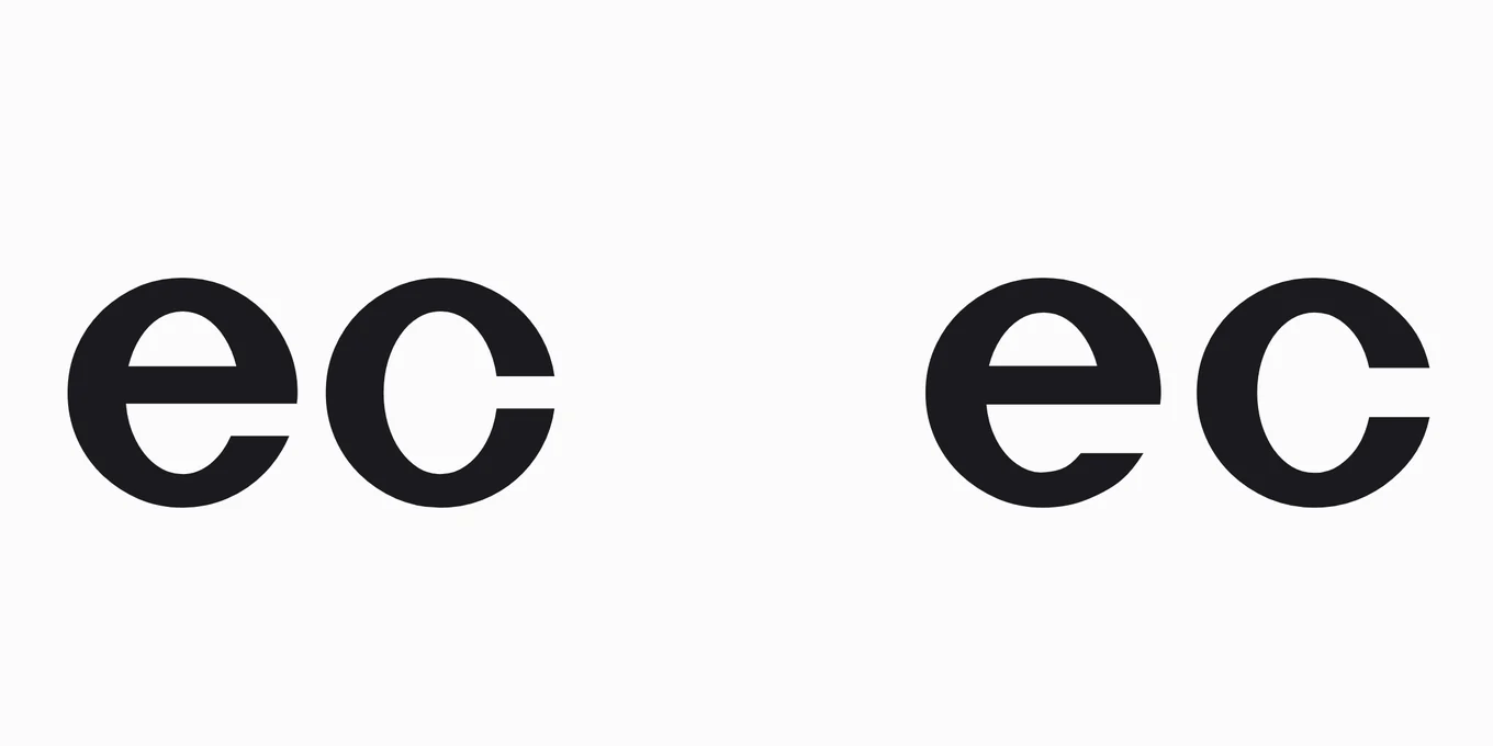
Does a font’s display version read better big?
Where it has been tested, no: the letters drawn for small text were read better at a headline’s size too. A display version earns its place by how a headline looks, and how much of it fits, not by how easily it is read.
Ebbi · 20 October 2026
Many fonts come in more than one version of the same letters: one drawn for text, and one for headlines, often with “Display” in its name. Set the text version big and it looks heavy and loose. Set the display version big and it looks sharp, fine and close. So the display version must be the one that reads better big.
That sounds obvious. Type designers have argued about it for almost ninety years.
The argument.
When type was cast in metal, each size was cut on its own, so each could be drawn for itself. The small sizes were drawn wider, with taller small letters, less contrast between thick and thin, and more space between them. The big sizes went the other way: narrower, closer, with finer hairlines.
In 1937 the historian of type Harry Carter wrote that the tails of the small sizes were cut short “to increase legibility”, and those of the big sizes drawn long “for the sake of elegance”. Decades later the type designer David Berlow put forward another idea, and John Hudson, another type designer, took it up: the big sizes are drawn so that big letters read better.
The test.
Matthew Carter, Harry Carter’s son, drew the font Sitka for Microsoft; it shipped in 2013. While he drew it, Microsoft tested it on readers at every stage, and it put that argument to a test. Sitka comes in six versions, each drawn for its own range of sizes, from Sitka Small, for 9.5 points and under, to Sitka Banner, for 27.5 points and up.
Each reader sat 50 centimetres from a screen and looked at a mark. A letter flashed there for a fraction of a second, a mask of random letters covered it, and the reader typed the letter they had seen. The flash was timed for each reader so that they named about half the letters right: give a letter long enough and every design scores full marks.
If big versions are drawn to read better big, Small should win at the small size and Banner at the big one. Both were shown at 9 points, the size of a book’s text, and at 36 points, a headline’s.
Letters named right, out of every 100 flashed
Sitka’s six versions, each drawn for its own sizes, in points
At 9 points
9 more in Small
the size of a book’s text, in Small’s own range
Sitka Small48
Sitka Banner39
At 36 points
7 more in Small
a headline’s size, in Banner’s own range
Sitka Small56
Sitka Banner49
Small won at both. At 9 points, readers named 48 letters in 100 right in Small and 39 in Banner. At 36 points, inside the range Banner was drawn for, they named 56 in Small and 49 in Banner. Small won for every reader in the test, and for 25 of the 26 letters.
The big letters were flashed faster than the small ones, so the two sizes cannot be set against each other. The two versions can, at each size, and the gap hardly moved: nine letters in a hundred at 9 points, seven at 36.
It came out the way the side of 1937 said it would: the side of Harry Carter, the father of the man who drew the letters. Kevin Larson, Microsoft’s researcher, and Matthew Carter wrote it plainly in 2016:
“The size-specific adjustments made for large sizes do not increase legibility for large sized text. If we want increased legibility at large sizes, we are better served using a small size-specific design. If our goal is instead some level of elegance or personality, then a large size-specific design is appropriate.”
What came after.
No test I could find has put two whole versions side by side again. Later tests took the differences one at a time, and they point the same way. In 2019, two researchers at the Royal Danish Academy found that bolder letters were easier to recognise at the size of a footnote, and no easier at the size of a book’s text; the lightest letters they tried did worst at every size. In 2025, a study of 60 readers found that taller small letters helped a little, and only when the print was small, and another found the finest hairlines the slowest to read.
Finer hairlines, lighter strokes, smaller small letters, closer spacing: that is what a display version is made of, in Adobe’s own words for its Garamond Premier in 2005.
The two type designers have since put it in other words. Tiro Typeworks, the foundry John Hudson founded, has sold Sitka since 2025 with this line: “The robust Small size design remains legible at 6 pt, while the elegant Banner style can be used up to poster sizes.” And in 2020 David Berlow wrote that “some vague sense of aesthetic improvement” was not, in his belief, why big versions are drawn: “It’s got economic purpose in print and online.” Closer, narrower letters fit more words in a line. When in doubt at small sizes, he wrote, take the smaller design, “as more readable text is likely”.
For your headline.
So pick a display version for what it does. It makes a big headline look the way its designer meant it to look, and it fits more of it in the same space. A text version set big can look clumsy; type designers call it horsy. Those are real reasons. They are reasons of looks and room, not of reading.
If a word must be read at a glance, the test points the other way: the version drawn for small text was the easier one to read at both of the sizes it tried.
A display version makes big letters look right. It doesn’t make them easier to read.
How I counted it.
Every test I could find that read letters drawn for one size against letters drawn for another, each read at its own page on 20 October 2026. One put two whole versions side by side: Microsoft’s, in Kevin Larson and Matthew Carter, “Sitka: a collaboration between type design and science”, 2016. Its numbers are from its own text; each is the share of flashed letters readers named right. Sitka’s ranges are from Microsoft’s own page. The tests of one difference at a time are from their papers or, for the two of 2025, their published summaries. Harry Carter’s words of 1937 as the 2016 chapter quotes them.
What the count cannot show.
Reading: the test flashed letters, not words, lines or pages, and across the whole of Sitka’s making, its makers write, they “did not demonstrate statistically reliable reading speed benefits”. How many readers: the chapter does not say for this test; its tests used “usually 10-12” people, aged 18 to 38. Other fonts: only Sitka’s two ends were tested, never its middle versions, never another family’s display version. Sizes beyond 36 points: posters and signs. Paper: the letters were on a screen. And beauty: no one was asked which they found more beautiful.
The test, to download.
Both versions at both sizes, with Sitka’s six ranges, as a table to download, free to reuse with credit (CC BY 4.0). If a re-count changes a number, it will say so here, with its date.
To cite. Ebbi, “Does a font’s display version read better big?”, ebbi.ai/seen/does-a-display-font-read-better-big/, 20 October 2026.
Sources. Every page read on 20 October 2026.
- Kevin Larson and Matthew Carter, “Sitka: a collaboration between type design and science”, in Digital Fonts and Reading, World Scientific, 2016
- Microsoft, “Sitka font family”, Microsoft Learn · Tiro Typeworks, “Sitka” and “About”
- Sofie Beier and Chiron A. T. Oderkerk, “Smaller visual angles show greater benefit of letter boldness than larger visual angles”, Acta Psychologica, August 2019
- Ben D. Sawyer and others, “Font Size, X-Height, and Readability: How Typography Affects Reading Speed Across Different Sizes”, Journal of Vision, 2025 — its summary
- Silvia Guidi, Anna Kosovicheva and Benjamin Wolfe, “Psychophysics of Variable Fonts: Do Multiple Font Features Interact to Impact Readability?”, Journal of Vision, 2025 — its summary
- David Berlow, on the CSS Working Group’s optical sizing issue, 20 May 2020 · John Hudson, TypeDrawers, June 2025
- Adobe, Garamond Premier Pro release notes, 2005 · Type Network, “Inside the fonts: optical sizes” · Adobe Design, “The old typography is new again”
- Wikipedia, “Harry Carter (typographer)” and “Matthew Carter”